
jowar puffs bg 1
LOGO REDESIGN | brand identity | packaging design | SOCIAL MEDIA
Aasnaa
Aasnaa is a wellness and health products brand that offers an ever-growing range of food and beverage products designed to bring us closer to the Good Life. Its sourced traditionally from the co-operative society of rural Punjab. Committed to the philosophy “nature knows best”, Aasnaa procures ingredients in season which are processed locally and modern food science is applied to ensure long shelf life and the minimal use of preservatives.

juice 1
objective
To deliver wellness and keep people connected through food, to their cultural roots in the fast-paced world.
& grand-moms, we bring to you time-tested delicacies in hygienic, convenient, shelf-stable forms.
Traditional is TastY
We believe food is best when it is natural. However, all foods do not grow in all places nor in all seasons. And this is where we come in, applying modern food science to add shelf-life to the natural powers of some incredible superfoods.
Natural is Better
Champions are born of years of practice, and we believe that the benefits of healthy habits compound over time. Our carefully curated selection of natural foods with therapeutic benefits makes the adoption of some healthy habits a whole lot easier.
Health is a Habit
A brand that believes healthful foods that are minimally processed to ensure their natural goodness is available in all seasons and geographies.


Group 48050
")

Health in tasty!
Typeface
Ubuntu
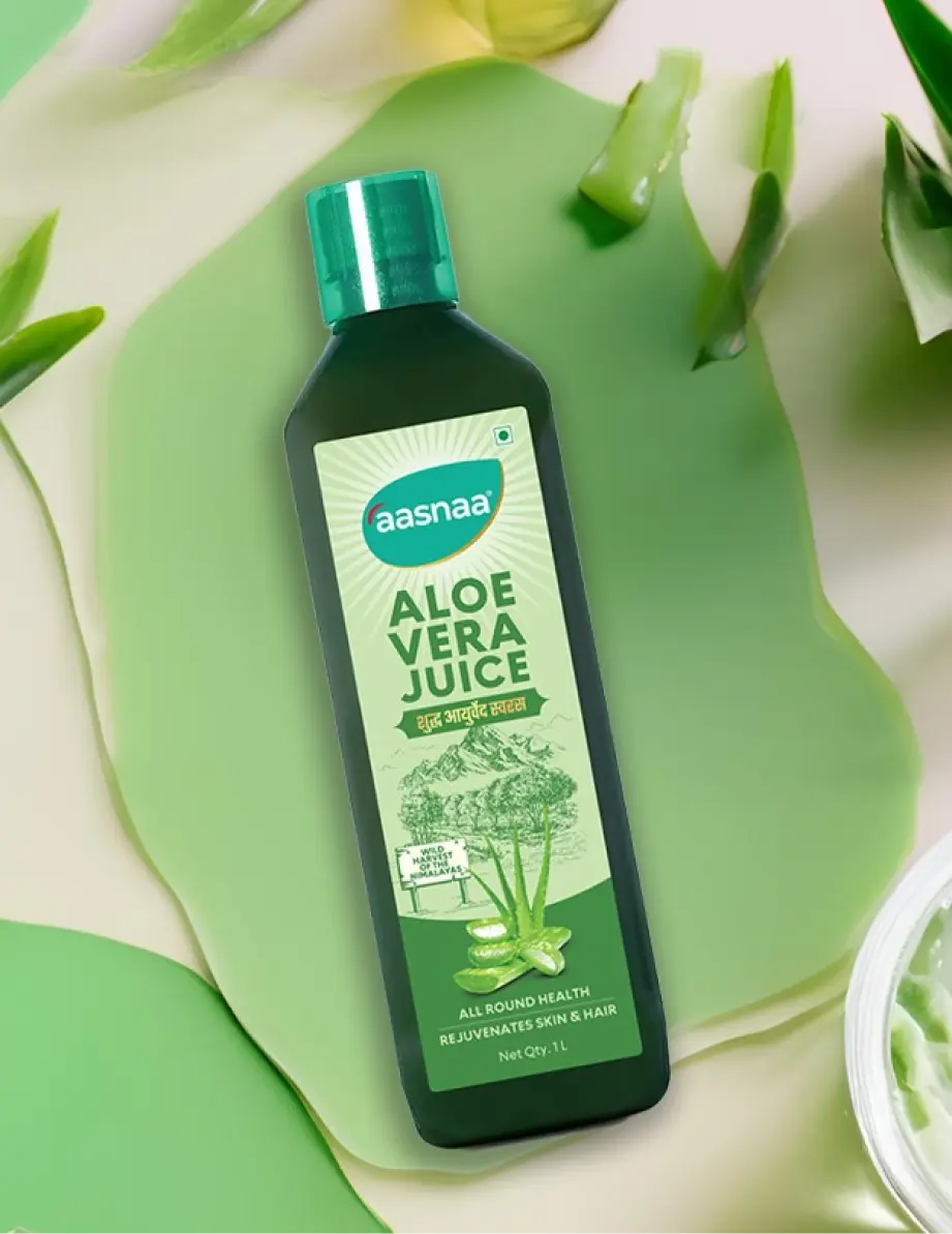
Packaging design
We embraced boldness in our packaging design, bringing ingredients to the forefront. Clear, prominent, and readable – balanced with childhood illustrations which ties people to that product category.

Group 48053
Turning Wireframe Into Design
Our approach centers on creating a website that seamlessly integrates current trends while pushing the boundaries of innovation.
tuscany soap 1
We wanted the consumers to feel confident in the products they choose to consume everyday while having health and wellbeing in mind.


N Treats 1
However, the common thread tying them together was the transparent display of main ingredients, each defined by its percentage.

