8813287 1
brand identity | packaging design
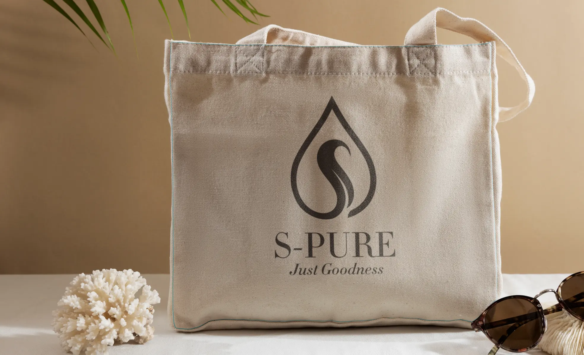
S Pure
Lorem ipsum dolor sit amet, consectetuer adipiscing elit. Aenean commodo ligula eget dolor. Aenean massa. Cum sociis natoque penatibus et magnis dis parturient montes, nascetur ridiculus mus. Donec quam felis, ultricies nec, pellentesque eu, pretium quis, sem. Nulla consequat massa quis enim. Donec pede justo, fringilla vel, aliquet nec, vulputate eget, arcu.

Mask group
Brand Promise
Daily Freshness for a Lasting Goodness.
A thorough analysis of the category, consumer behavior, and competition yielded invaluable insights:
It was over used and did not hold its true meaning.
Category
competition
consumer
A brand that believes in a culture of openness, honesty and nothing-to-hide.
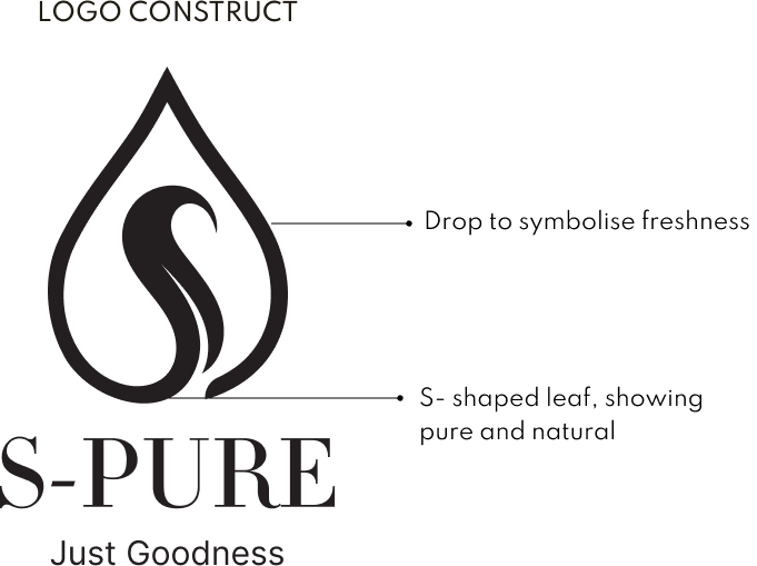
The brand colours were carefully chosen to reflect a earthy, nature based colours to emphasis the brand’s promise of purity.

Group 48063

Group 48064

Group-48065l
Vector
packaging design
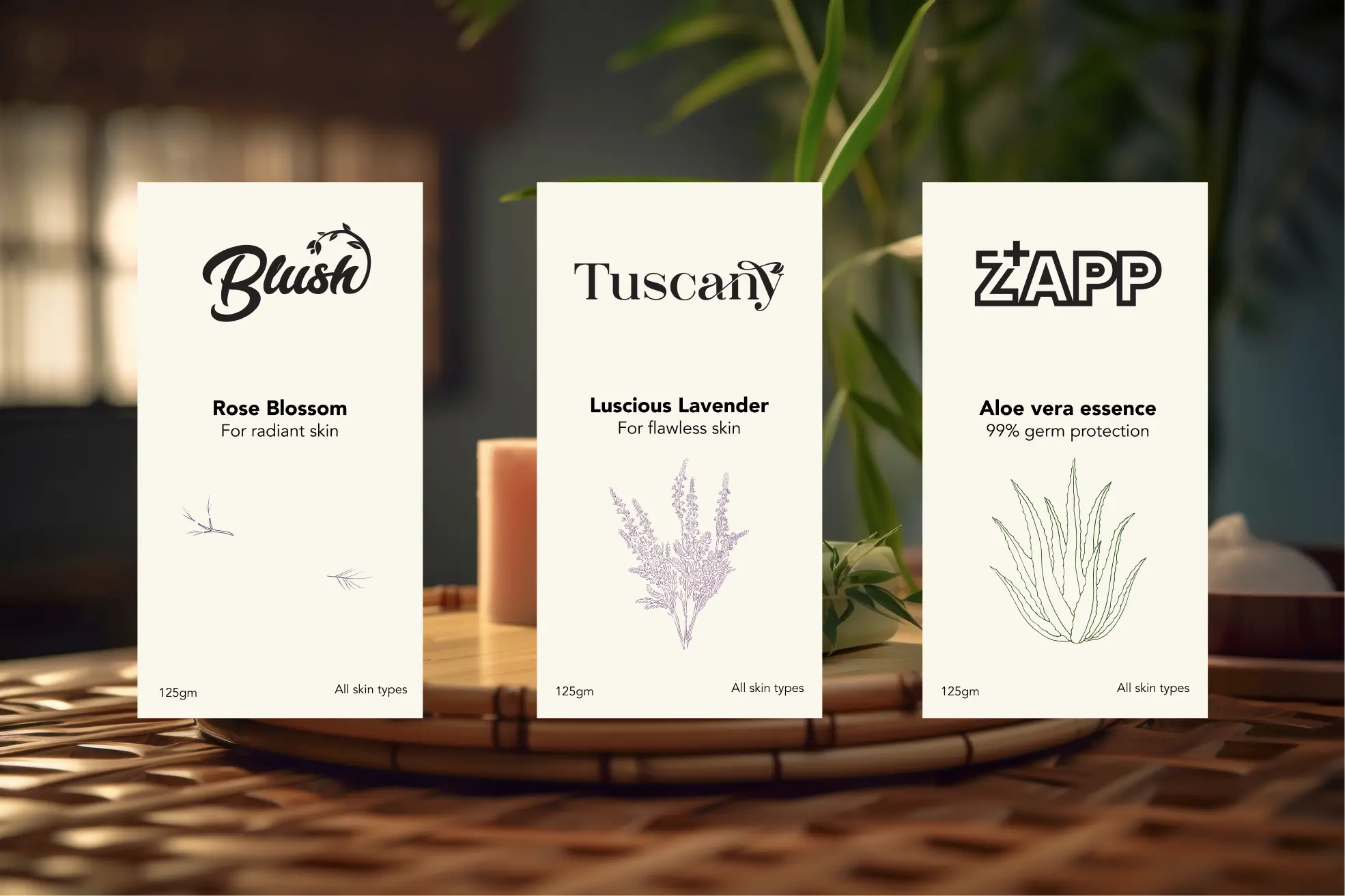
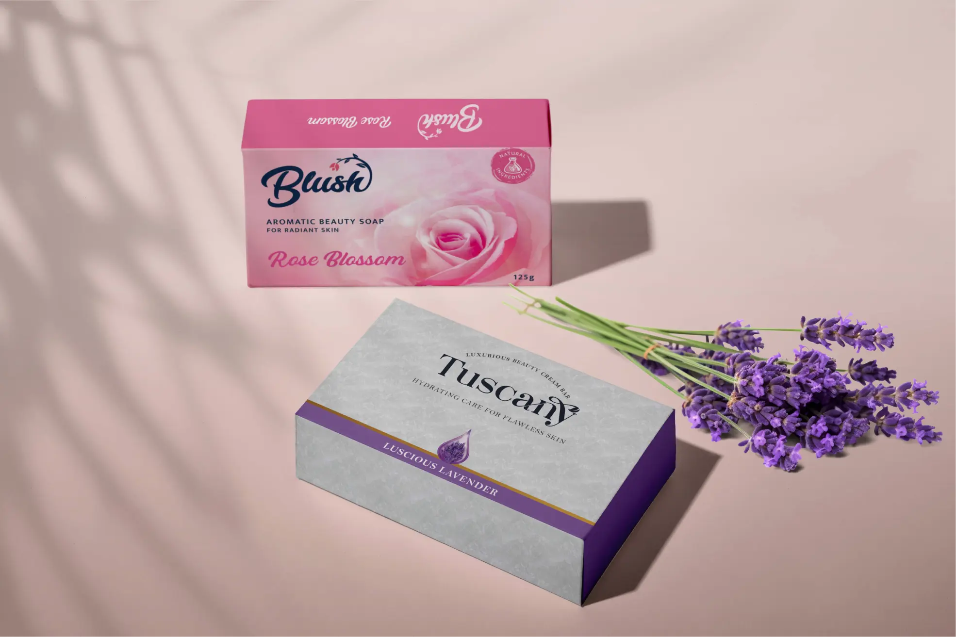
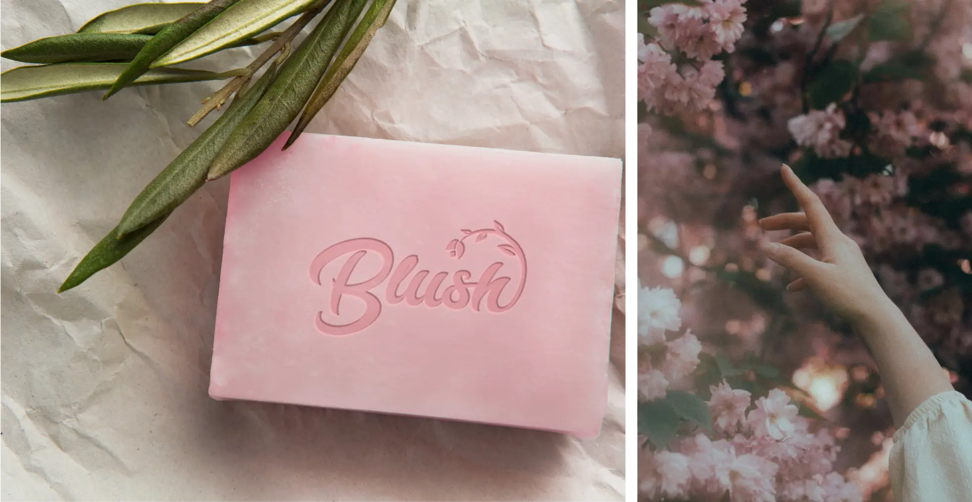
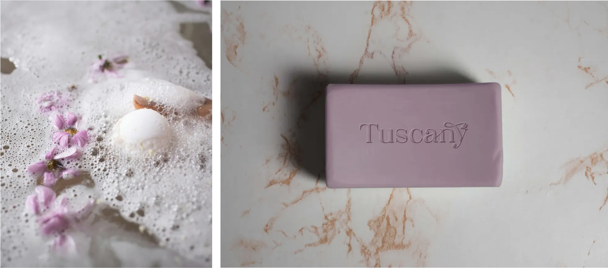
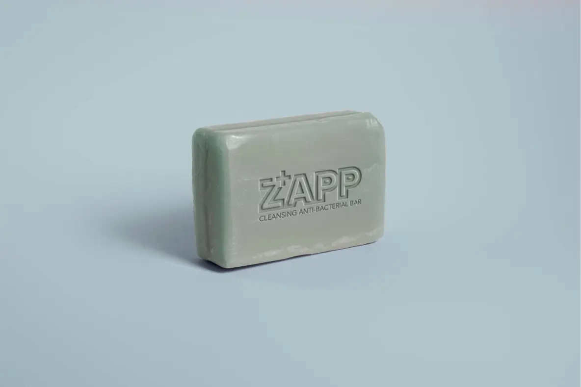
We designed the packaging to highlight the main flavour profile of each sub-brand while crafting unique visual identities.
“Blush” evokes a whimsical experience, perfect for those seeking a touch of indulgence.
“Tuscany” embodies luxury with a sophisticated design, promising a pampering touch.
“Zapp” uses bold visuals to communicate its unwavering commitment to hygiene.
9759338 1
Group 48066
Group 48067
7569749 1
However, the common thread tying them together was the transparent display of main ingredients, each defined by its percentage.
