all 2 1
brand identity | packaging design
Veridic
Born out of the desire to make a difference, Verdic was founded by a team of individuals who shared a common vision – to create a personal care brand that prioritizes transparency in every aspect of its operations. We embarked on a journey to redefine personal care by putting honesty, integrity, and trust at the forefront of everything we do.
DSC_0527 1
objective
Where Transparency Isn’t Just a Pledge, It’s a Guarantee
A thorough analysis of the category, consumer behavior, and competition yielded invaluable insights:
It was over used and did not hold its true meaning.
Category
competition
consumer
A brand that believes in a culture of openness, honesty and nothing-to-hide.

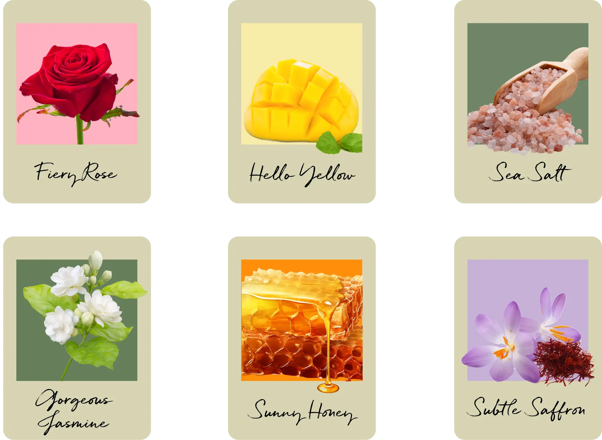
The brand colours were carefully chosen to reflect a earthy, nature based colours to emphasis the brand’s promise of purity.

Group 48069


Group 38679

Title Typeface
Quickbrush
Body Typeface
Avenir
packaging design
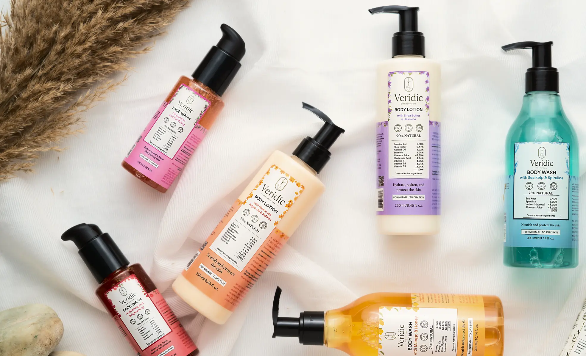
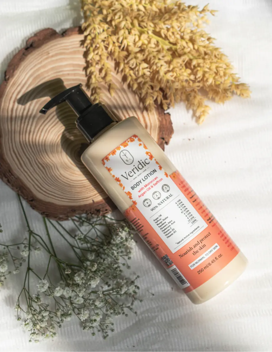
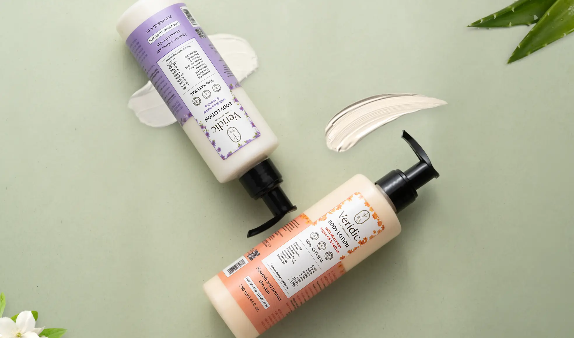
We embraced boldness in our packaging design, bringing ingredients to the forefront. Clear, prominent, and readable – because transparency is our ethos. With nothing to hide, we stand firm in our belief that strong brands are built on a foundation of trust.

DSC_0366 1
This bold move wasn’t just about aesthetics; it was a statement of integrity. By placing our ingredients in plain sight, we declared to our customers: “We have nothing to hide.”
We want them to feel confident in the products they choose to use on their skin, knowing that every ingredient has been carefully selected and thoughtfully sourced.
body lotion 3
all 3 1
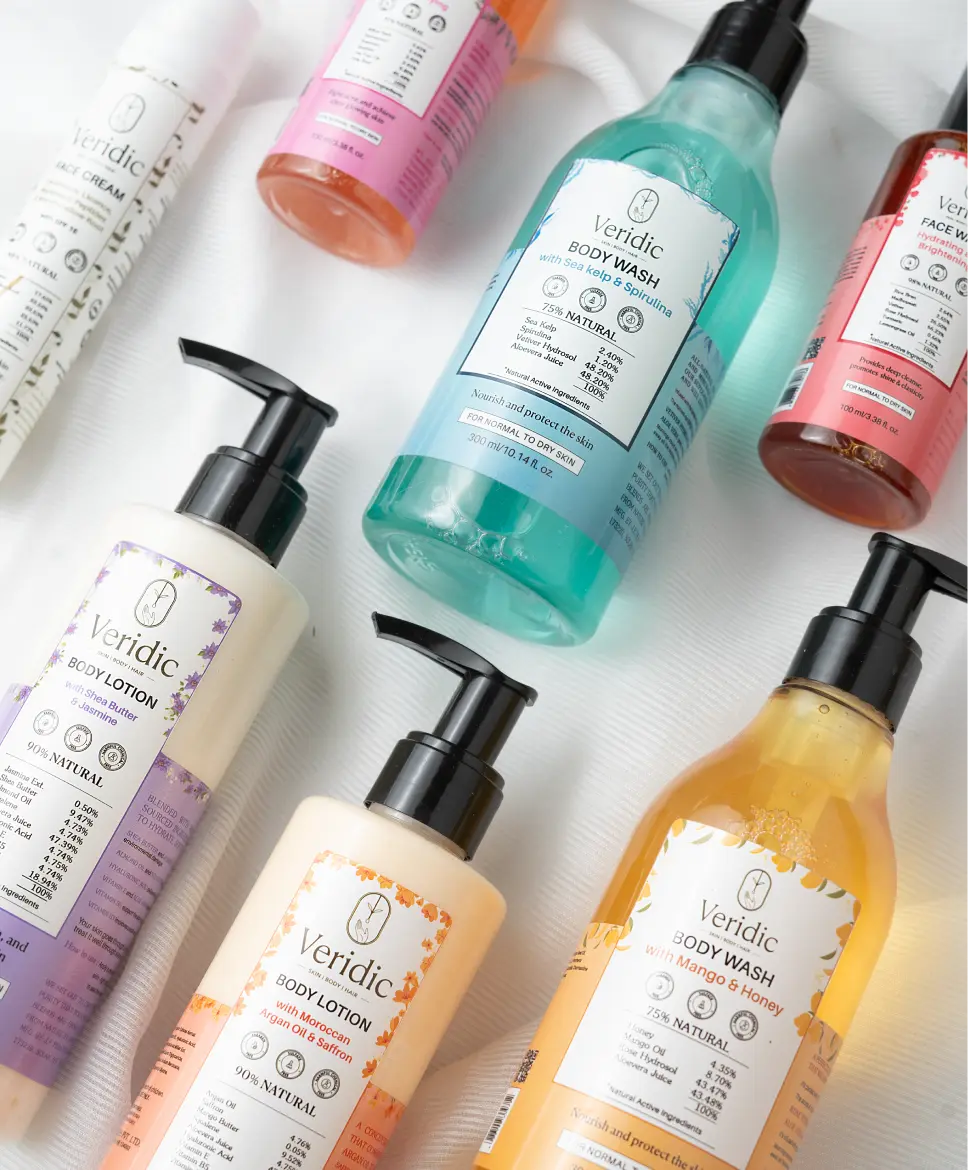
In crafting the packaging for each product, we aimed for a blend of uniqueness and coherence. Each product’s packaging was distinguished by its vibrant color and a focus on its key ingredient.
However, the common thread tying them together was the transparent display of main ingredients, each defined by its percentage.
updlaptop_screerns0044 1
285 1
We’re did not just redefined personal care category; we reshaped the relationship between consumers and their products